We believe that by taking a relevant sub sector for comparison, performance can be accurately placed into the context of the business environment. Our chart below is an illustration of such a peer group comparison looking at profitability changes year-on-year.
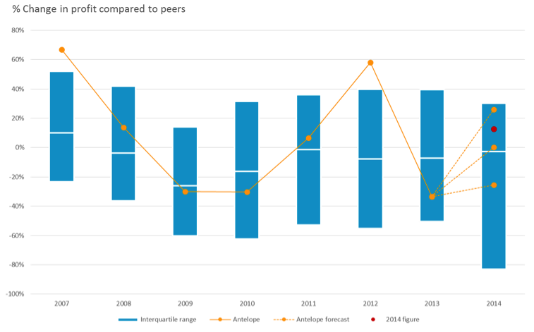
Blue bars in the chart indicate the second and third quartiles of improvements in profitability in the peer group, above the blue bar is upper quartile performance, below the blue bar is bottom quartile performance.
A company “Antelope” is shown for comparison on the chart. During 2008 and 2009 the entire peer group found these years difficult for profitability, the median profitability, shown as the white line across the bar, indicates falling performance. Antelope (in orange), saw changes in profit broadly in line with peers during these years of contraction. However during the recovery in 2011 and 2012, Antelope outperformed in 2011 and then turned in an upper quartile performance in 2012.
However in the following year, 2013, Antelope arguable suffered from over-reach from the earlier growth years in 2011 to 2012 putting in a third quarter performance. However when we looked forward to forecast 2014 we used our algorithm to produce three dotted lines representing higher middle and lower expectations for improvements in profitability. In this case when the actual performance was reported, shown as the red dot, Antelope delivered better returns than expected, but well within the range of what our algorithm would suggest is normal for this company for 2014.